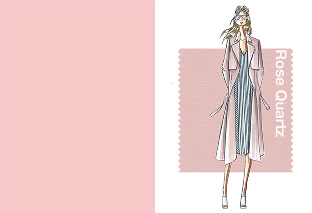
The Pantone Color Institute released its fashion color report for Spring 2016 and all we can say is that it’s crazy good!
The Best Pantone Spring 2016 Colors to Wear
The spring 2016 color report is aptly headlined, “A Transporting & Transforming Canvas.” The colors represented in this year’s report are a mix of calming and vivid hues that transport people to a place of relaxation, curiosity and exploration.
Pantone and color designers create these colors through pure inspiration and expression, but for us, we can’t help but gush over how pretty they are to look at.
So, without further ado, let’s take a look at the spring Pantone colors to start shopping ASAP!
1. Rose Quartz

Rose Quartz is a light pink that is perfect for the spring season. It urges everyone to absorb and appreciate the beauty of their surroundings regardless of how busy their day is.
Feelings: soothing; calming; persuasive, yet gentle; compassionate; balanced.
Looks like: a budding flower, serene sunset, flushed cheeks.
2. Peach Echo
Peach Echo is more part of the orange family than it is the pink. It can be likened to a coral pink color, one reminiscent of bright spring and summer days. Nowadays, orange shades are all the rage in fashion and design communities.
Feelings: warmth, accessibility.
Looks like: a more tempered hue in the orange family.
3. Serenity
Much to our delight, the spring season shows us beautiful clear blue skies we can’t help but get in awe over. Serenity is the color that gives you those feels we all tweet about.
Feeling: airy, weightless, calming, respite during difficult times.
Looks like: a transcendent blue that naturally connects you to your sense of space.
4. Snorkel Blue
5. Buttercup
Buttercup may not be the sweetest and most calming color of the group but it certainly offers the contrast we need.
Feelings: happy, excitement.
Looks like: “A shining beacon transporting its wearer to a happier, sunnier place.” – Pantone.
6. Limpet Shell
The name Limpet Shell is too cute and we like how clean and fresh this shade of blue is.
Feelings: freshness, clarity, mindful tranquility.
Looks like: a shade of aqua that is clear and clean.
7. Lilac Gray
Gray in springtime? No problem! The color designer added some lilac undertones to make this Lilac Gray worthy of spring.
Feelings: subtlety, neutrality.
Looks like: an edgy classic gray color.
8. Fiesta
This is by far the boldest color in the palette. Fiesta gives some punch to the softer hued palette of the season.
Feelings: high energy, excitement, free-spirited exploration, strong, fiery.
Looks like: yellow-based red that is rejuvenating, passionate and thrilling.
9. Iced Coffee
Looking for a neutral tone this spring? Iced Coffee is the definitive winner.
Feelings: earthy, natural, soft, subtle.
Looks like: an earthy tone that serves as the foundation to any spring outfit.
10. Green Flash
The Green Flash is a color that invites wearers to go on adventures, urban adventures.
Feelings: adventurous, sense of exploration, escaping the mundane.
Looks like: a brilliant hue of green with an openness to invite wearers to push the envelope.
So much thought and inspiration was put into this spring color palette that it makes me motivated to start shopping for these colors as soon as possible.
Before I end this, I want to leave you with a statement made by Pantone Color Institute’s Executive Director, Leatrice Eiseman:
“Colors this season transport us to a happier, sunnier place where we feel free to express a wittier version of our real selves. With our culture still surrounded by so much uncertainty, we are continuing to yearn for those softer shades that offer a sense of calm and relaxation.”
In our busy and hectic schedules, we could really use hues that naturally calm and relax us. Thanks, Pantone, for making our lives better one color at a time!
With current trends that have gripped the beauty and fashion world, it’s nice to see a return to basics, to natural hues that remind us of our place in the world. We can all use a break every now and then, so if you’re looking for your next getaway, see these beautiful places to reset and recharge.
For more of the latest in fashion trends and outfit ideas, add us on Facebook!